At The New Political, the editors, managers and I wanted to update our brand, making it more more modern and approachable. We wanted look like a professional, legitimate publication that Ohio University students and staff and Athens, Ohio community members could come to to get their city, state and campus news. Additionally, at the same time we were recreating the brand, we were also updating the website, and we wanted the new brand to more effectively work with the design website, creating one cohesive look.
When we started to research and sketch ideas for the new brand, we knew that we did not want to deviate too much from the original logo. We wanted to keep the red and blue theme, not just because we are a political publication, but also a bipartisan publication that shares both sides of the story, and possibly the circle for brand recognition.
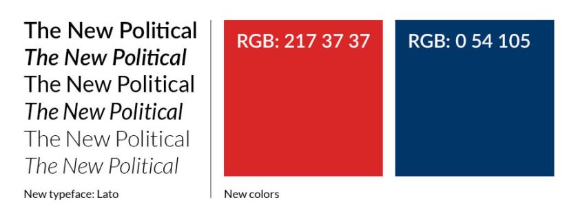
After researching typefaces, colors and other politically-themed logos, we came up with the new design.


Although not a true circle, notice how the circle theme is still portrayed in the o in “political.” Additionally, while researching typefaces, I fell in love with the ligature in “political,” to me it added more personality and vitality to the logo.
After we nailed the logo, we moved on to the overall branding of the site and our presence as a whole on the internet.


To see the overall brand, please visit thenewpolitical.com