At Campus Recreation, we had started to work on updating our facility signage, and realized, if we were going to update our brand, this was the time.
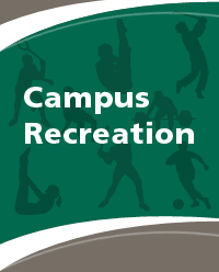
The original brand, as seen on the left, had many silhouettes, and what I can describe as a “90s” feel, along with dark colors. This inspired us to modernize the brand and make it feel brighter, happier and, in a way, more fun. After all, our job as an organization is to get students to be active and enjoy being active.
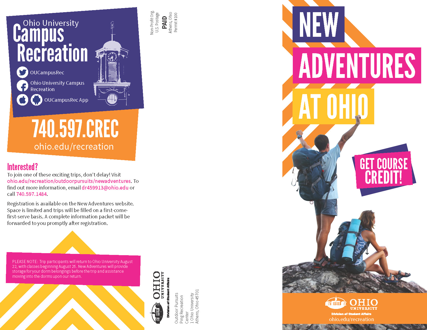
As we started to research and explore the possibilities for the new brand, I started working on a brochure for New Adventures, a freshman orientation program that we run. I forget how or why it happened, but I decided to put in arrows to direct readers to the header and used blocks to highlight the pieces text. The design was a huge hit among staff and students, so we knew that this was the right direction to go in.
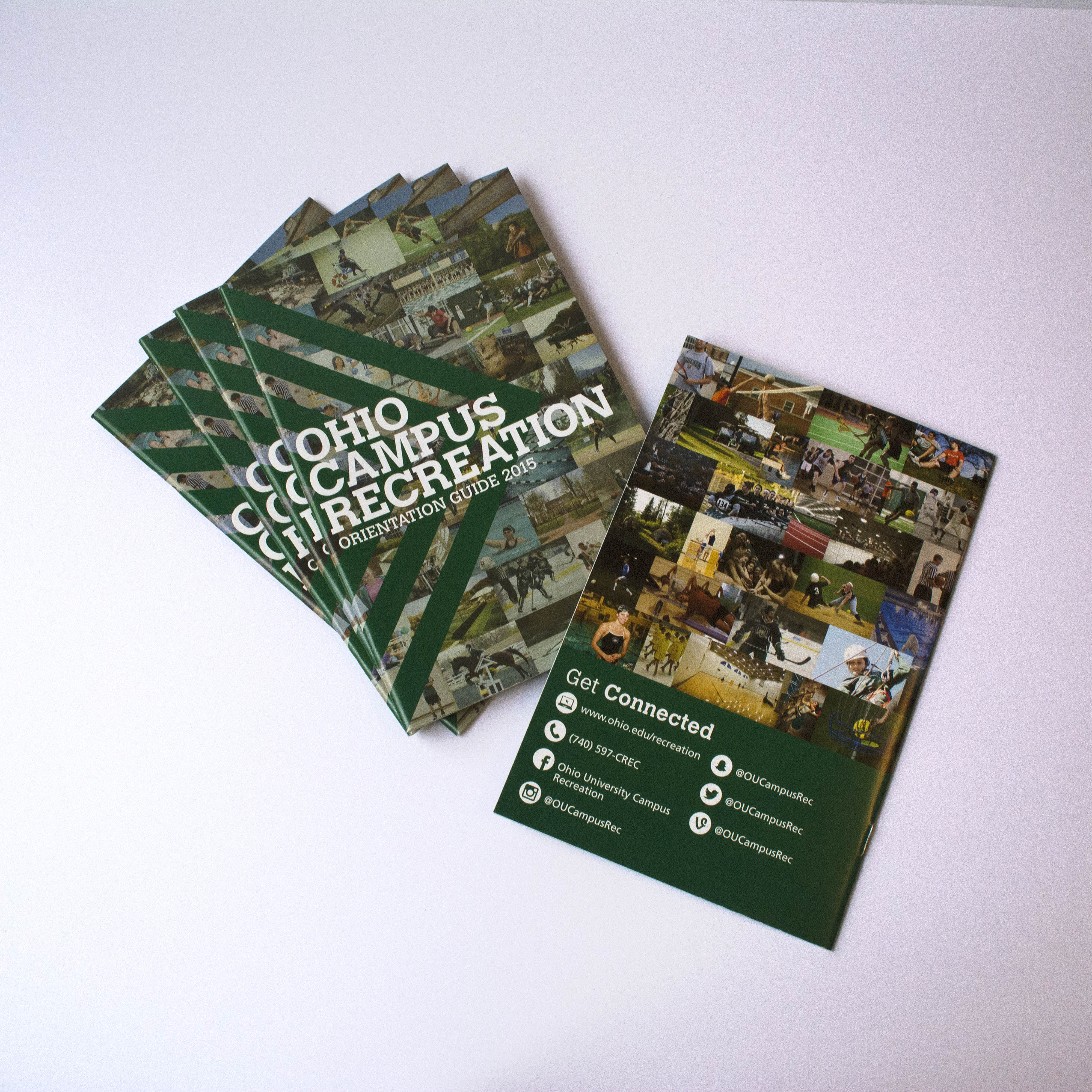
After making that discovery, we started work on an orientation guide for incoming freshman, giving them all the information that they need to know about Campus Recreation.
We researched what other universities were doing for this sort of thing, and came to the conclusion that each aspect of Campus Recreation needed to be broken down into its own individual section. With that, we wanted to have an icon and a color associated with each department.
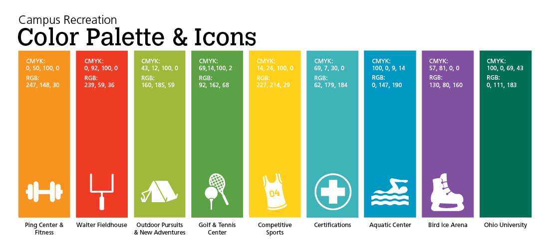
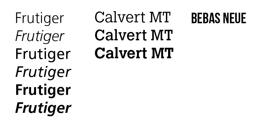
Additionally, we wanted to pick new typography. Frutiger is Ohio University’s designated san serif, which we have to use, so we decided to use that for all of our body copy. Next, we wanted to choose our own typeface for headlines. After figuring out what went well with Frutiger and what fit with our brand, we decided to pick two typefaces, Bebas Neue and Calvert MT. Both provide this youthful vibe that we loved. After trial and error, we have decided to use Bebas Neue for large format pieces (because it reads well large) and Calvert MT for smaller pieces.
After creating the new brand, our facilities look so much brighter and more inviting than ever before. All of our new permanent signage and social media use this style, and we have started to work it into less permeant event posters and our website, creating one cohesive look.
